Empowering admins with tools to prioritize & process learning requests
Year
2022
Role
Lead Designer
Length
360Learning's Enterprise plan is a system that leverages a company's content experts through collaborative learning to answer the needs other employees have. It does this through three features: Projects, Learning Needs, and Suggested Experts.
Projects
With the need for a way to optimize planning & delivering training content to customer's teams, the project tool was created. The tool brings your teams together to foster collaboration - all within the project workspace. Streamlining your training delivery as projects multiply.
Since I joined the Enterprise plan team to lead the design for the foreseeable future, some design problems that I've spearhead were:
Upgrading the Project Grid
Problem
The current design is confusing, complex, and doesn't include important information.
Goal
Simplify the overall design of the projects grid and include other important information admins & squad members need to view.
Old Projects Design
New Projects Design
Review Flow Design
Problem's
Today, reviewers are confused because
when they arrive on the Course's homepage, there is no indication that they are in review mode
when they get inside the course, in "editing" mode, the "Validate review" CTA is next to the "Next" CTA, so they expect it to be activity-based, but when they click, it validates the whole review
users expect to be able to partially validate the review
once you "Finish" the course, there is nothing on the last page indicating you performed a review / allowing you to validate everything at once
Goal
To create an experience where reviewers or admins can exchange contextualized information during the review, so that feedbacks are as precise as possible and issues tackled efficiently.
When the user starts the review they can now approve the activity or mark that it needs work
After the reviewer marks that an activity needs work, the 'next activity' button will be enabled
The reviewer will then be prompted to leave feedback for the content author
After feedback has been given it'll be posted in the discussion as an internal comment and the activity will be marked as a yellow pencil in the left hand navigation
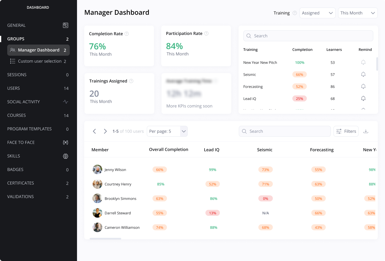
Redefining visualizing data within our Dashboards
Problems
Users in multiple roles want better visualizations of data currently available & new data we haven't displayed yet
Managers want to see data on how their team is performing on their training but there's no way to see it currently
Admins want to view how projects & learning needs are being used across the platform
Goal
Redefine the current data visualization experience on the dashboard by providing a simpler & visually satisfying experience.
Old dashboard's data visualization design on the platform
The Manager's Dashboard allowed managers to see their team's data on their training progression over any time range - This information was previously not available visually until this design
An Enterprise plan dashboard I designed with new components to further define the future vision of visualizing data on the platform
Creating visibility on Learning Needs throughout the platform
Problem
Across the platform currently the learning needs feature has a difficult discoverability that prevents users from submitting their training needs. This in turn doesn't allow the admins to know what new training their users need.
Goal
Create an easy to use & easy to find way for users to share their learning needs so admins can make trainings to solve those needs
We added a new 'Learning Needs' section on the homepage and gave the user a visible entry point to sharing a need they might have
The entry point allowed the user to easily share a Learning Need from the homepage